Understand Disney’s 12 principles of animation(Part 2)
And we’re back! In the previous blog, we covered the first six principles of animation.
Here we look into the remaining six principles of animation that every animator should know.
While animation is constantly evolving, these twelve concepts continues to form the base and is taught in all popular animation institutes around the world.
Arc
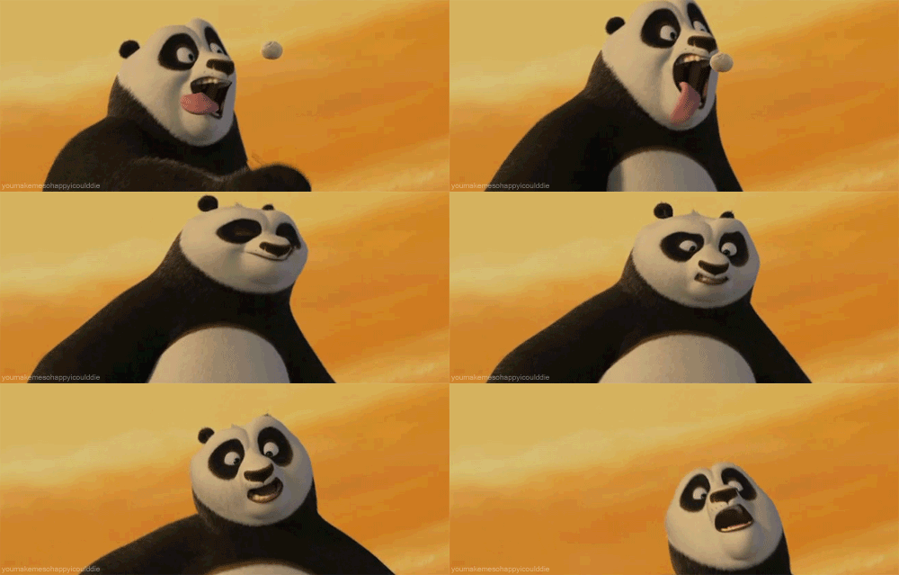
Try waving your hand, swinging your leg or turning your head. These a natural arc to these movements. This arc brings in realism to characters in animation, unless, of course, your character is a robot. See how Po’s head moves?
Staging
Derived from the concept of staging in theatre, this is the process of setting up a scene with the appropriate placement of characters, background and foreground elements, and camera angle. Staging should clearly set the mood for the action and keep the audience’s focus on what is relevant in the scene.
Secondary Action
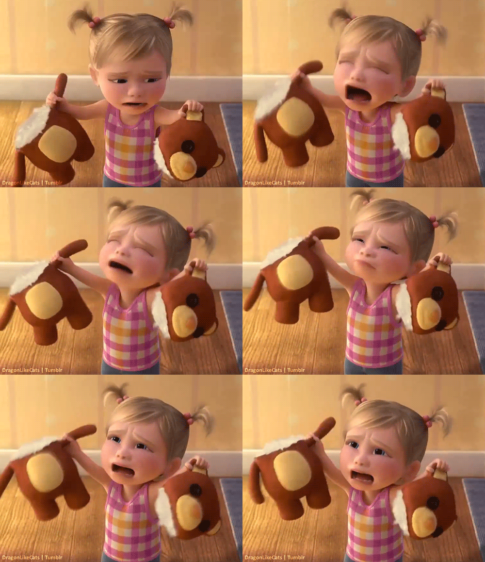
As the name suggests, this is an action that supports the main action of a character. A character may whistle while walking or scratch his head while thinking. Such actions add dimensions to character animation. If there are multiple secondary actions, they should work together in support of one another. Look at little Riley’s actions while she screams at the top of her lungs.
Exaggeration
This principle is self-explanatory. Animated movies and cartoons allow for the most amazing thing – exaggeration. Imagine, how boring Kung Fu Panda will be without Po’s exaggerated expressions or how plain Tom and Jerry will be without the exaggerated movements of the characters. Exaggeration of facial features, expressions, actions, and attitudes add more appeal and fun to the characters. Here is a classic example of exaggeration.

Solid Drawing
In 2D animation, solid drawing is about maintaining proportions, volume & weight of a character or an object regardless of the action. With the introduction of 3D animation, the challenge of distorted drawing has been minimised. But the concept of posing out your characters with correct balance & weight remains as important as ever.

This character design by Robert Kopecky for Proscenium is a good example of solid drawing. Kopecky is creating a character that will live through various iterations of history in the video.
He starts by defining the volume of the character, which he describes in this character sheet at a teardrop/bowling pin. Then he adds different clothing, hair, and accessories to the character to take him to various parts of history.
Notice how you can see the other side of the body shape on the inside of the mouth. But also, even when he is departing from three-dimensionality for graphic effect, as in the position of the eyes, he defines that in the character sheet too.
Appeal
In real life, you may call it the charisma of an actor. In animation, it is the ‘appeal’. Every character should have an appeal that interests the audience. An appealing character is not necessarily cute & cuddly. Villainous & monstrous ones too have to be appealing. Clear drawing and good character design will define the personality of the characters. After all, who would have thought that a slender woman in a nice red dress could be a super villain? Yet, here she is…Scarlet Overkill!
Now get back to that drawing board and practice these principles of animation to improve your work.
Watch this space for more tips and tricks of animation.
Interested in a career in animation? Take a look at the animation career courses that can help you get the right skill sets!
Understand Disney’s 12 principles of animation(Part 1)
Disney’s 12 principles of animation were first introduced by animators Ollie Johnston and Frank Thomas in their book The Illusion of Life: Disney Animation, first released in 1981.
Post a Comment
要发表评论,您必须先登录。
