
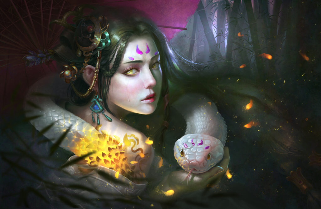
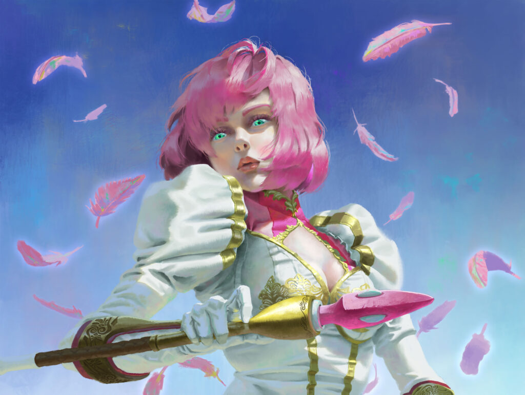
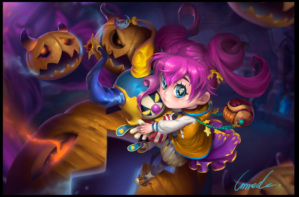
Photoshop Tips: Create Realistic Lighting
Lighting is one of those things that can make or break an illustration. It can set the mood, establish photo-realism, tell a story, and even guide the viewer into certain areas of your work. To fully understand how light works, you must study it in detail, and a great way to do so is to create your lighting references. Add an extra sense of realism to your art with the help of these lighting insights.
No matter what your photography skills, you can do it yourself with almost any camera – in most lighting situations, even your smartphone camera will do. Find the perfect lighting conditions for your reference folder and start taking those photos with your friends. You can use the piping tool to sample your palette when you get home.
When doing so, try to capture every possible angle. Body parts exposed to the sky may have different shadow colors than parts facing downward. Even in the tiny curves and wrinkles of the face, you will find light scattering, reflecting, and bouncing.
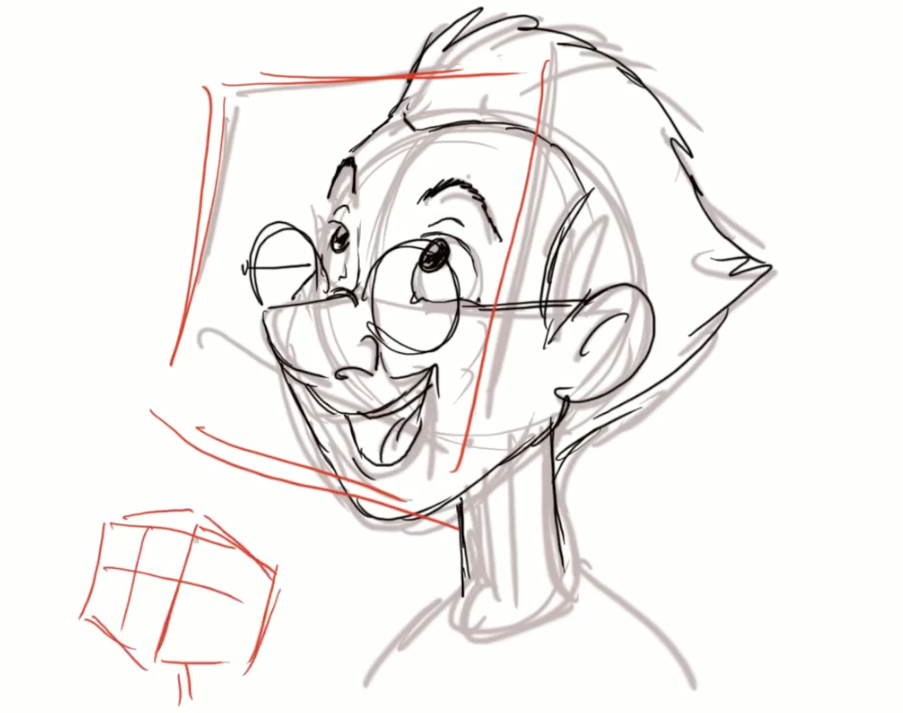
1. Draw lines
Create line art sketches in the style that best suits your needs. You can outline which parts will appear or be pushed back into the area. This helps you determine how to color the character later. You will not see this line art in the finished image, so there is no need to make it nice or clean. You just need to draw out the general character to lay the foundation for coloring and lighting later.
2. Create a reference
If you can, have one of your friends pose for you. Realistic lighting can provide some help with this, and it’s a good idea to have a plan about what you want to draw when you take these photos. If your character is in a forest, go to the forest to get the right lighting conditions.
3. Analyze the reference
You need to study your reference and create a palette based on color and lighting. Consider the reflected light in the shadows. Pay particular attention to the fact that the shadows under the figure’s chin are a different color than the shadows on the forehead or cheekbones. You can set these areas according to the reference lighting.
4. Apply flat colors as a guide for painting
As an intermediate stage, you can create a solid color version of your work before applying it to light. This means that you simply give everything its neutral object color. This may come in handy later when you may need to mix colors.
5. Handle the most prominent shapes
Start by roughly painting the most important shadows and lights using a large brush. Don’t dwell on small details like tiny hairs, eyelids, or wrinkles for now. Keep things simple. Also, be sure to paint while you are zooming in. At this early stage, keep your entire illustration visible on the screen at all times.
6. Check similarity
Pay close attention to your character reference (if you are using one) to make sure the similarity is on track. Sometimes when applying light and color to a line sketch, the essence of the character can be lost. This is why you want to work under line art first. At this stage, you can start working on a new layer above the lines.
7. Check your values
Go to Image>Adjustments>Black and White. Make sure this effect layer is on top of all layers. This black and white or grayscale view allows you to compare the values in the painting with those in the reference photo. If there is a large difference in a specific area that should not be there, you should be able to spot it.
8. White background bounce light
Light and white have a unique relationship. Compared to dark colors, whites and other light colors respond differently to light sources. In high light, they usually maintain the color of the original object.
9. Remember the quality of the hair
It is always fun to paint hair. Whether dark or light, healthy hair is shiny and also has a translucent quality. The darker the hair, the more pigment it has, which usually also means it is less translucent as well. However, when light hits someone’s hair, it scatters through it. So whenever you draw hair, consider its translucency, shine, and possible reflected light.
10. Create realistic eyes
The eyes should have no visible dark lines. Unless makeup is involved, the eyes will lack a clear black line. Even dark lashes are more likely to be painted with a few interrupted strokes. Check your photo references and pay attention to the gradations that shape the curve and crease of the eyelid. The eye itself has a glossy texture, so it won’t consist of just a single color. In certain lighting conditions, light-colored eyes can even appear dark.
11. Balance the appearance of lips
Portraying lips can be tricky, especially when drawing lips with natural skin tones. They can easily end up looking like the person is wearing lipstick! This is why gradients play a crucial role. Use either the bottom or top lip, or even both, to blend the edges with the skin tone. Start from the corners of the mouth and apply towards the center.
12. Apply Multiple Methods in Edge Work
You may always make a conscious effort to place sharp edges and soft edges correctly in your painting. The usual strategy is for strong, bright edges to get a soft glow, and for very dark edges to blend softly with the background color. Anything between dark and light can be soft or hard, depending on the mood you are in.
13. Finer details
This is the place to work on painting the texture of skin, eyes, clothing, and any other material that may be included in the image. Remember, a smart painter will keep the highest proportion of detail and the smallest brushstrokes in the most important areas (the focal areas) while leaving the more unimportant parts loose and not causing distraction.
14. Make a final check
Complete all these steps before calling the painting complete. Is the portrait correct? Contrast? Reflected light from the environment? Color gradation? Material expression? Proportions of detail? We are often too eager to share our latest work with the world. Keep it to yourself for a week and you’ll find some elements that need improvement before you’re ready to show it off.
If you want to learn more Photoshop lighting tips, welcome to follow Wingfox.
Lighting Rendering Tutorial:Techniques for Advanced
Is there a secret to learning lighting rendering? Why is it that when I render a model, the result is always a bit of a fluke? Then this course is the solution for everyone who feels hesitant and confused when it comes to lighting rendering.


Post a Comment
要发表评论,您必须先登录。
Pingback: 8 Things Maya Beginners to Know
2022-04-25Pingback: Student Taskwork:Background Animation
2022-04-26